Catching Up with Natasha Law

As part of our ongoing effort to highlight contemporary female artists whose work we admire and look forward to following in the years ahead, C2 is thrilled to share an interview with London-based artist Natasha Law. We are excited to feature recent installations of works by the artist in our collectors’ homes.
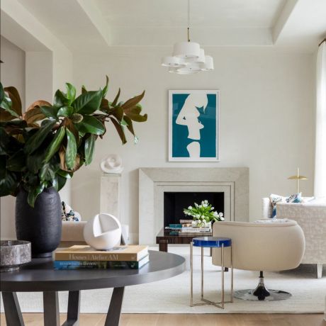
The arresting paintings of Natasha Law have long captivated us. The artist is known for capturing silhouettes of women in some of their most intimate, yet ephemeral, moments of the day: dressing and undressing. The artist’s works are glossy and bold, but beneath the surface, they convey a sense of quiet and vulnerability. Law studied at Camberwell College of Art and has since exhibited her work in London, New York, Tokyo, Los Angeles, and Palm Beach.
C2: Could you tell us more about your artistic process, beginning with whether you draw from life or photographs (and if you prefer one over the other)?
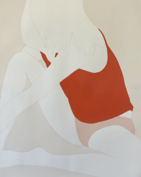
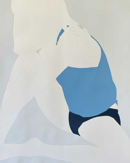
NL: I always enjoyed life drawing, and really properly fell in love and lost myself in drawing when I began rapid drawing from life in a method that I subsequently discovered was called the blind contour method but to me was just a way of trusting my hand to follow what my eye was seeing and allowed me to capture people and scenes as I traveled- considering that it constantly bemuses me that my process for my paintings begins not with life drawing but with a session capturing on camera as the subject moves and interacts with their environment. This arose from my initial desire to find a way to have the subject interact as little as possible with myself as the observer or recorder- as if I was a secret witness of a private moment. I could pull out the frame in which a movement or gesture was entirely natural and unposed. My favorite drawings are still the ones that are almost awkward or ungainly: that moment pulling on a sock when you nearly unbalance, or awkward elbows and wrists as you unhook a button or clasp at your back.
I start with this session and get my image sequences, and then start drawing from these. I usually use a thin G-Tec style pen for drawing. I like to lose as much extraneous detail in my drawings as I can get away with to get a simple, fluid line. At this point I can usually tell which few I’m drawn to recreate on a larger scale. Sometimes, I’m looking for shapes that will work when the focus is very close up and on a section of the figure is painted; other times I’ve been more focused on the mood of a sequence and can’t resist using almost the complete length – head to toe (or knee). These get drawn onto my large, primed metal frames (or very large sheets of paper) in pencil. At this point, I start work on the frames lying flat on trestles. The paint is unforgiving, and each coat takes at least 24 hours to dry so working flat is necessary to avoid running and drips. I brush the paint on in sections and sand gently between layers.
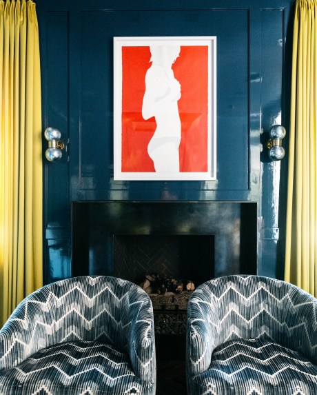
Image courtesy of Julie Soefer
C2: You have explained that you depict your female models in varying stages of undress, and in moments in between vulnerability and intimacy. What led you to wanting to capture these fleeting moments in your practice?
NL: I usually answer this question by referring to shared moments of intimacy and privacy, how I am both identifying with the subject whilst also being the voyeur. I’m capturing moments I treasure about being female as an external witness.
As I was trying to pin myself down and answer this question, I found myself thinking, what was it about watching someone getting dressed, even sometimes the act of dressing yourself, that I found so particularly pleasing or satisfying to observe? Was it something to do with competency, with self-sufficiency? That familiarity with your own body, the particular easiness of motions and muscle memory involved in the process, the mixture of decision making, and negligence involved in finding the things you need to put on to go out and interact with the world? I keep thinking of the scene near the end of Breakfast at Tiffany’s when Audrey Hepburn is changing outfits in the back of the taxi. I’m always fascinated by how efficiently and deftly she switches outfits, wriggles out of tights or into trousers, pulls on shoes, puts on makeup- she knows herself and how to make all this happen without looking in a mirror and all the while carrying on a conversation (or argument?).
Perhaps there’s something that lies behind all that, which I’m failing to put my finger on exactly, that intrigues me about these moments of capability, personality, privacy. We express ourselves with our clothes, with our gestures and how we move, but we are all the more interesting when we are doing these things unobserved or without thinking of ourselves as observed- so a private, personal moment almost, even if it’s only because we aren’t necessarily thinking about what we are doing.
C2: How did you begin using household gloss paint as your preferred medium? Does this medium pose any challenges?
NL: I think it was a combination of cost and quantity! Actually, I know there was also the ‘flat’ quality too that I couldn’t see getting satisfactorily from oils or acrylics. I wanted to paint big, chunky sections of flat color and no bleeding of colors into each other and having sidelined in the film art department and house painting for a few years I knew I wanted the juicy, glossy quality that our varnish-based gloss paint has. It was a medium I felt really comfortable working with, and I think I’ve also always felt a bit of a loner when it comes to ideas like ‘the art world’ so whilst I can happily wander the aisles in a huge, wonderful art suppliers and enjoy all the charcoals, brushes and paper on offer, there is just something about the lack of fuss I’ve always preferred about buying my paint by the gallon in hardware stores.
C2: Who are some of your past or current artistic inspirations?
NL: One of the most exciting shows I saw before everything closed down was the Rachel Feinstein show in New York in 2019-20 (Maiden, Mother, Crone at The Jewish Museum). Bookending that is a fantastic recent show in London of Helen Frankenthaler’s woodcut prints. They are very different shows but possibly unified by the confidence and uncompromisingly adventurous nature of the artists involved.
If it’s a question of inspiration I will either be looking at the colors (maybe just one bold shape of yellow like an Ellsworth Kelly print or the colors and combinations of Cy Twombly) or there’ll be something about atmosphere and sentiment (Ryan McGinley or Annelies Štrba).
There are two artists whose work I buy whenever I can afford it and thinking about them both side by side, I realize they share many things in common. Jim Threapleton (who now works out of Canada) paints incredibly powerful, visceral pieces that speak of the absolutely elemental- tempests, anatomy, dreams- and Mary Mathieson, who has the most incredible sense of color and whose pieces pulse somewhere in between visions and references to nature and botany.
C2: We love your use of color and have seen it range from soft to bold. Can you share some insight into how you select your color combinations and/or if you have a personal favorite?
NL: I was going to describe myself as a color magpie (not sure if that properly conveys my constant collecting of colors as and when I see them throughout my day/life/travels). I occasionally manage to grab a photo in passing- it could be some bits of paint on a wall, a tee shirt next to a colored trainer, some plants against a wall- and I manage to file it away in that way. More usually I just have to log it in my memory, and it stews away in there so that when I come to try out some colors together, I have variations on what I remember which I can then play with.
I definitely have favorites though. It transpires (never grew up being a girl who liked pink!) that I absolutely love pink in all its shades, except possibly when it starts to turn into fuchsia. It’s those nude to blush to rose to coral or bubblegum tones that make me so happy, and combining one of those with a banana yellow or an apple green- I have to stop myself from making all my pieces the same sometimes! There’s also a wonderful orange-red that I love using, and then a pale greenish grey-white that I always want to pair with this deep green, and dark colors with bright ones- deep aubergine with some coral, a tiny bit of bright green or dark grey.
I have a flat board on the floor of my studio where I place the rubbery top layers of my paint (I sometimes have to cut them out to get to the fluid paint underneath in the can). Slowly, over months, this board builds up with layers of these discs – I realize I do place them on there in combinations I’m going to like looking at – and as it gets covered new combinations are accidentally presented to me also.
 |
 |
C2: We are working to educate our clients on the intricacies of various printmaking processes. Can you share your preferred method(s) and expand on whether or not it’s a medium you personally enjoy experimenting with?
NL: I love printmaking. I have to admit to having a very specific relationship with it. Its roots lie somewhere amidst the kind of arts/craft taught generally to kids of my generation, such as linocuts and paper pick-ups, and then to an art O-level and A-level (art examinations at 15 and 17 years old in the UK) where my art teachers had their backgrounds in screen printing and textiles so all of us studying art were taught how to coat screens, expose them, and build up color through multiple screens. This was largely done in an incredibly low-tech art room with not a huge amount of facilities: one sink and an old handheld sun lamp to use for exposing the photo emulsion. Even later when I was first working on simple line screen prints to go with some of my earliest shows, I was using the screen printing studios available in Brixton for textile students. I’m strangely at my happiest working around constraints and making things work on a slightly DIY level. I love linocuts still, love collage, but somehow despite doing litho prints and etching at college I have a mental block about those two which I’d love to spend some time getting over! Nothing is more fun than messing around with these materials and managing to reproduce a drawing or image of your own in ink. It changes it somehow, and then to play with colors and experiment with what you can add in or take away- suddenly you’ll be making all your own seasonal cards for everyone!
There are wonderful books now that talk you through the different processes very simply, and I really recommend looking up the beautiful wood-cut prints of Helen Frankenthaler that I mentioned previously.